Sunday 15 November 2020

How To Spot Reversals In Forex

 A Forex Reversal is the bouncing of price to a different direction; providing opportunities for traders to enter the markets...


Reversals are areas on a chart where the price of the market bounces from the direction it has been

moving in and then moves in the opposite direction. 

Traders look for areas where this might happen, before it happens, to then profit from the move in the opposite direction.


Here Is A Youtube Video That Takes You Through 3 Awesome Methods To Easily Spot Reversals…


This is a deceptively simple concept because it can be very hard to correctly identify where a

Forex Reversal will take place.


So I have some methods for you that will help you To Spot Reversals In Forex...


Support and resistance Levels

Support and resistance levels are levels on your chart where price has bounced off or reversed several times before.


As it has bounced off these levels in the past, if price now reaches one of these levels again

then price may well bounce once more and traders can capitalise on the bounce


When I draw these levels I differentiate between monthly strong levels (red Line), weekly

medium levels (Blue Line) and daily levels (black line).


If price has reached a monthly level it is more likely to bounce off that level than if it has

reached a weekly level and, conversely, if price has reached a weekly level it is more likely

to bounce off that level than if it has reached a daily level


This is important because it helps you decide if the point at which price is at is likely to be

a place where the price will reverse.


If price is at a monthly level for example it is more likely that the price will bounce off this

level than if price has reached a daily level.
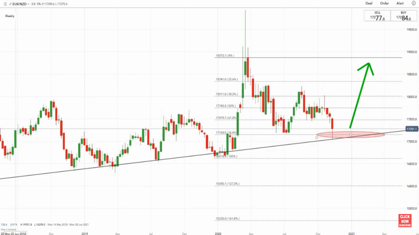
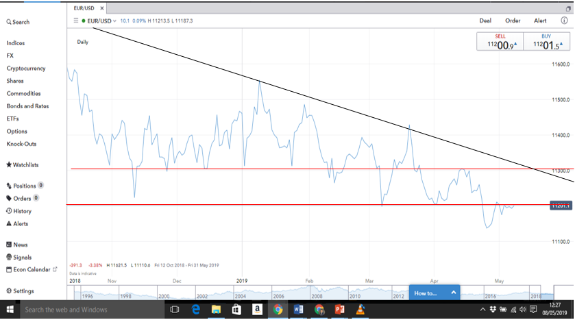


Trendlines


Trendlines are a sloping form of support and resistance levels and work in conjunction with

horizontal support and resistance levels.


Trends are either uptrends or downtrends. In order for an uptrend to be valid it must have

created 2 higher highs and 2 higher lows.


In order for a downtrend to be valid; it must have created 2 lower lows and 2 lower highs.


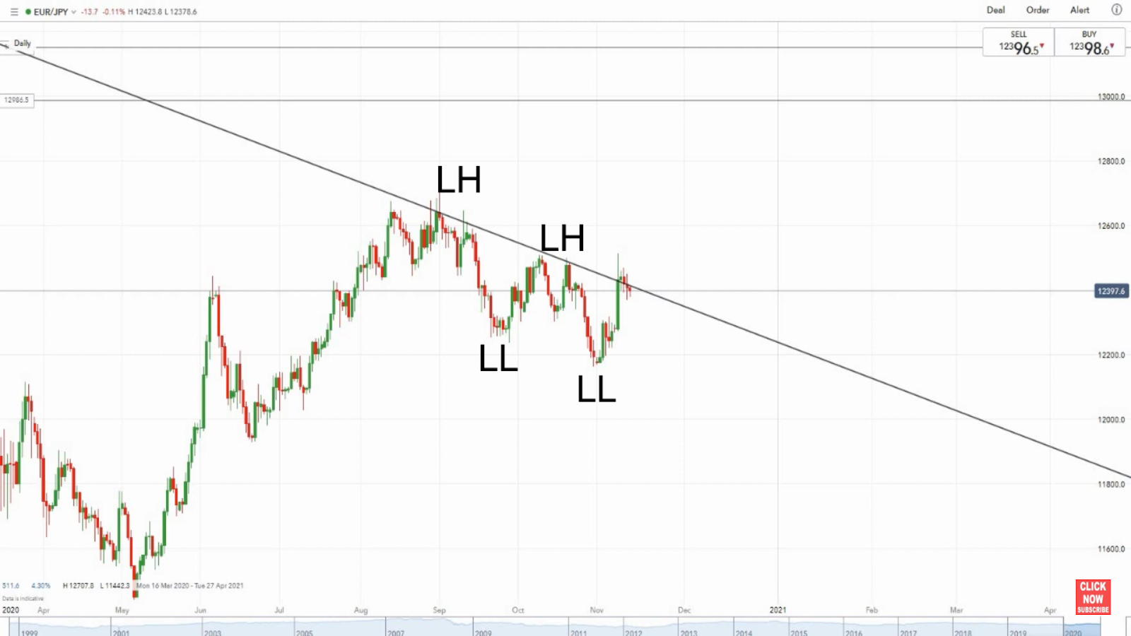
A trendline is then drawn on. 


In an uptrend; the trendline is drawn below the trend and must join the 2 higher lows. Traders

will then look for the price of the market to move back or retrace towards the trendline. Once

price reaches this point it is a first indication that price may bounce off this level and traders

will look to place a long trade that will profit from the potential following bullish price action.


In a downtrend; the trendline is drawn above the trend and must join the 2 lower highs. Traders

will then look for price to rise back to the trendline, again as indication that price may bounce

from this level and they can place a short trade which profits from potential following bearish price

action.


Fibonacci Levels


The Fibonacci indicator is used in a trending market where it has, by far, the greatest effect.


There are 5 main levels which are the 23.6% level, 38.2% level, 50% level, 61.8% level and

the 76.4% level.


In an uptrend, the Fibonacci indicator would be drawn from the most recent higher low to the

most recent higher high. You would then drag across your screen so that the levels cover your

chart.


You can see above that the levels appear when you do this. From this point traders would be

looking for price to retrace back to one of these levels. When price comes back and looks like

it is stalling at one of these levels, this could be an opportunity to enter a long trade and profit

from the potential following bullish price action.


In a downtrend, the Fibonacci indicator is drawn from the most recent lower low to the most

recent lower high. Once again, drag the indicator across your screen so that the levels cover

your chart.


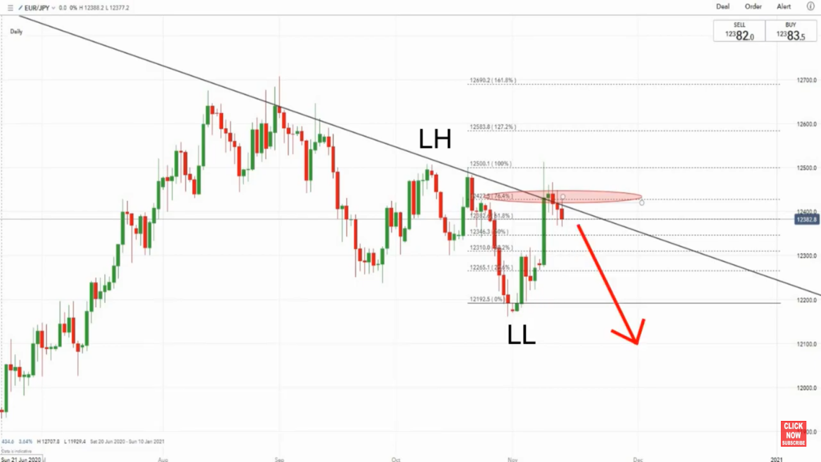
From this point traders will look for price to retrace back up and stall at one of these levels. This

could be an opportunity to enter a short trade to profit from the potential following bearish price action. 


Combine The Indicators Together


The great thing about this and the other 2 indicators is that they can be combined together. If, for

example, price has retraced to a support and resistance level and is stalling, it could be a good place

to enter a trade. But, if you combine the indicators and also find that price is on a trendline and a

Fibonacci level then this increases greatly the likelihood that price may reverse from the point you

are looking at.


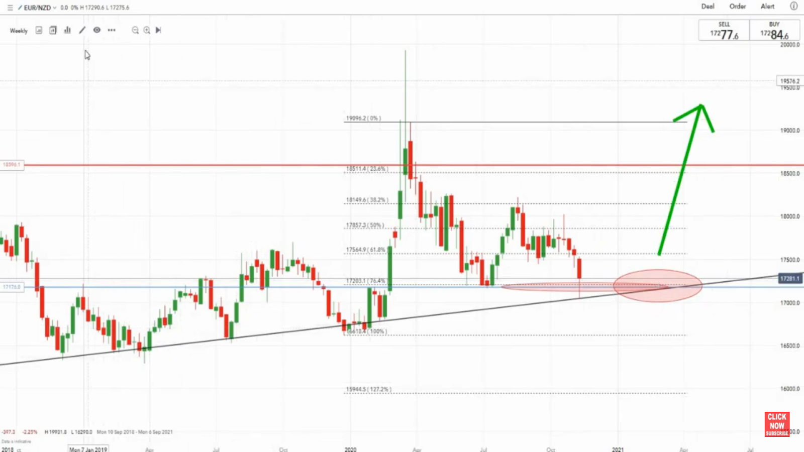
As you can see above; not only has the market retraced from a higher high to a weekly support

level (coloured blue) but this also coincides with the ascending trendline.


If we also add on the fibonacci indicator we find that price is also hovering around that 76.4% level.


If we get further confirmation that price is about to reverse then this could be a good place to enter

a trade.


Ok guys, I hope you enjoyed reading this blog post! Make sure you like it, comment to ask me any

questions you have and follow me to be notified of my updates - I am going to be posting regularly

so follow me to make sure you don't miss anything!


Until next time...

Monday 22 July 2019

Where To Trade Double Top and Double Bottom Chart Patterns

What Double Top and Double Bottom Chart Patterns are and How to Trade them is Fairly Widely Covered. 

However, Where To Actually Trade Each Pattern Appears to be Missed and This is What I want to Cover in This Blog Post...

These patterns are some of the most common to be found in the charts. They are a really good indication of when the market may be exhausted running in a certain direction and, therefore, may be about to change direction.

This fact means that traders can use these patterns to spot a possible opposite move in the markets and then profit from that move.

Also, Here is a Free YouTube Video That Takes you In-Depth Through What The Double Top and Double Bottom Patterns Actually are, Where to Trade Them, How to Identify them and a Strategy to Enter them - Using Real Time Chart Examples


So, let's just remind ourselves of what the Double Top and Double Bottom Patterns show:

Double Top

This pattern shows exhaustion from the buyers in the market. It normally occurs after a bullish move but then the buyers fail to push the market higher past a certain level twice. The fact that it is TWICE is significant because it means that this is a level that the market is failing to push above for some reason. When market participants see this it is likely that buyers will take their profits and sellers will start coming into the market decreasing the price of the market.


Double Bottom

The pattern shows almost exactly the same as the Double Top but in reverse. Also, instead of the buyers being exhausted, in the case of the double bottom it is the sellers who are exhausted. So, as sellers close their short bets and more buyers come into the market, it is likely that the price will begin to rise.


Knowing this, traders will look for these patterns in certain places in trends and that is what we are going to look at next.


Where To Trade The Double Bottom

A market can move in three ways - up, down and sideways (uptrend, downtrend and range). 

It is advisable, especially when starting out to trade with the trend. This is because trends can go on far longer than anyone can stay liquid in the market and going against the tide of the market is far more likely to cost you money than help you make it.

With this in mind and looking at the below uptrend diagram...


...we can see that the market keeps coming down to (or retracing) to the diagonal line (ascending trendline). What traders will look to do is buy the market (go long) when it reaches the ascending trendline at the points labelled "trading opportunities". In this way they can profit from the increase in the market and the continuation of the trend. 

So, because a double bottom signals when a downtrend may have run out of steam and may be about to reverse, traders will look for double bottoms at the "trading opportunities" points, to signal that the market might be about to rise and so they can trade long.

So, remember, in uptrends you are looking for the formation of double bottoms at the points where the market meets the ascending trendline.


Where To Trade Double Tops

In a downtrend this method is simply reversed...

In this instance traders will look to sell the market (go short) to profit from the market decreasing. To do this, they will look for double tops to form at the points labelled "Trading Opportunities" to show that the retracement to the diagonal line (descending trendline) has run out of steam and the market may be about to reverse and continue to decrease.

Rememeber, in a downtrend you are looking for the formation of double tops at the points where the market reaches the descending trendline.


Where To Trade Double Tops And Bottoms

In a ranging market, as in the diagram below...

...you have the opportunity to trade the market both long and short. When the market reaches the top of the range you can look to sell/short the market to profit from the decrease back down to the bottom of the range.

When the market is at the bottom of the range you can look to buy/go long to profit from the increase in the market back to the top of the range. 

This means that at the top of the range you would be looking for a double top, which would signal that the rise to the top of the range may be about to end and reverse back down to the bottom. In contrast, when the market reaches the bottom of the range, you would be looking for a double bottom to form, which would signal that the decrease in price has run out of steam and a reversal in price may be about to happen back up to the top.

Remember, in ranging markets you can look for double tops at the top of the range to short back down to the bottom of the range and double bottoms at the bottom of the range to go long back up to the top of the range.


Ok guys, I hope you enjoyed this blog post and learnt something. Don't forget if you want more in-depth instruction about how to trade double tops and bottoms, then check out my YouTube video at the top of this page.

Also, hit the like button to let me know that you like my content and comment with any questions or queries you might have - I will try to always answer as quickly as possible.

Until next time...

Sunday 12 May 2019

Which Moving Averages To Use As Best Forex Support and Resistance Indicators


Moving averages can be a fantastic tool to use as dynamic support and resistance…


The advantage they have over static support and resistance levels like trendlines, is that they use an average of recent price levels to form their smooth lines, arguably making them more reactive and, therefore, a better indication of where the price of the market may respect.

Here Is a YouTube Video That Will Take You Step By Step Through How To Analyse A Trend Entry Using Moving Averages As Your Support And Resistance Indicators

 Best Forex Support And ResistanceIndicator To Use To Trade Support And resistance


So, the big question is which ones should you use!?

With so many blogs and tutorials out there suggesting their favourite methods it can be tough to know which is the best one. I want to take a slightly different route and help you to decide using a test strategy on your charts.

Ok, first off, moving averages are most useful in trending markets – that is uptrends or downtrends. Now, they are not completely useless in ranging markets, but as support and resistance levels, trending markets are certainly preferable.

So, you have your market that is in a trend – as you can see from the image below – which is a 4 hourly chart of the NZD/CAD.


We can see that the downtrend has already given use 2 lower highs and we want to try and use our moving averages to enter on the third lower high. Now, what we are going to do is go through the various moving averages to see which ones give us the best indication of resistance.

So the most commonly used ones are:
10 day
20 day
50 day
200 day

What we are looking for is 2 moving averages that, once applied to the chart, the market bounces in the middle of.

So, personally I always start off with the 20 day and 50 day as you can see below.


Now, here we can see that these two are simply too low for this time frame on this pair.

So next I will get rid of the 20 day and add the next moving average, which is the 200 day. This is the step you should follow on any market you are looking at.


So, here we go! Now we can see that our two higher lows have bounced right in the middle of our 50 and 20 day moving averages and so these are the correct ones to use for this situation.

Right, so we are now going to be looking for price to retrace in-between the 50 and 200 day moving averages before we place our trades.

One final point is that you should always have at least 2 points of reference on your charts, no matter which indicator or technical analysis method you are using – I have found that horizontal support and resistance levels work really well with moving average support/resistance.

Here is an example of what this would look like once you have added it to your chart:


So, in actual fact you will not only be looking for the market to retrace in-between your moving averages, but you will also be looking for it to meet one of the horizontal support/resistance levels before placing your trade!

I hope you found this article useful, don’t forget to follow me to be notified of the articles that I am posting and hit the like button to let me know what you think.

Also, feel free to comment below with any questions you might have regarding moving averages as support and resistance indicators!

Thursday 9 May 2019

Combining Trendline and Horizontal Levels - Support and resistance Forex Trading Strategy

 Many beginner traders are aware of using trendlines and horizontal support and resistance levels individually but do not use them effectively enough together...


In this blog post I want to explore the steps to take to combine them and then use real time examples to show you how this can be applied in the markets.

Here Is A YouTube Video That Will Give You A 5 Step Forex Support And Resistance Forex Trading Strategy...


Step #1 - Line Chart

So, the first step is to ensure that you have a line chart selected as opposed to a candlestick chart. Whilst candlestick charts can be useful for a lot of situations, especially later in the strategies, a line chart is a lot clearer at this point.

Step #2 - Determine The Trend

A lot of beginners make the mistake of looking for the horizontal support and resistance levels first - this is a mistake because you can spend a lot of time finding the best horizontal support/resistance levels in the world, but at the end of the day there might be no trend to trade!

So, an uptrend is confirmed when you are able to draw a line through 2 higher lows and a downtrend is confirmed when you are able to draw a line through 2 lower highs. take a look at the downtrend example below:


In this image we can clearly see that a line can be drawn through 3 higher highs on the Euro/Us Dollar pair confirming that this is a downtrend. You can also see that ensure maximum clarity a line chart has been used.

Step #3 - Determine Support and resistance Horizontal levels

Now, here is where you need to correctly identify support/resistance levels. To do this look for areas on the chart where support/resistance has occured at least 3 times - this is counted as a major level and price will likely pause again at this level. Have a look below at our chart:


As you can see above there are 2 major support/resistance levels and we can see that price has broken through and retraced to the first one.

This could be a potential trade and many traders would take this opportunity. However, the safer option is to wait to see if price retraces further - it is likely that, if it does, it will retrace to around the point where the second support/resistance line meets the descending trendline - if this area holds then this will represent an excellent trading opportunity. 

In the end it is down to you which option you would take but....

Always remember guys, whichever trades you are taking make sure you use a stop loss!

Ok, thank you for reading this blog post - I hope you found it useful. Follow me to be notified of all my blog post updates which will happen each day!

until next time...

Wednesday 8 May 2019

The Psychological Importance of Support and Resistance Levels

Support and resistance levels can be thought of as the "battle lines" where the bears and the bulls face off...


There can be no doubt that this can seem like a simple concept but support and resistance levels can come in many different guises and, as you dig deeper, you realise that these crucial areas are more difficult to master than they first appear.

Here Is A YouTube Video Which Gives You 3 AMAZING Tips On How To Identify And Draw These Deceptively Simple Levels...


However, there is no denying that they represent levels were traders of all shapes and sizes in the market are aware of and so to ignore them or to negate their importance will be the downfall of many a trader.

So, resistance occurs where a downtrend pauses - due to buying activity coming into the market - the signature bounce can be seen;


Resistance, on the other hand, acts like a ceiling where an uptrend pauses - again a bounce is visible;


These levels should actually be thought of more as areas because the market will not always fall or rise to exactly the same level. Therefore, traders can miss out on potentially profitable trading opportunities if they think of these levels as purely lines.

Another important feature of these areas/zones is that even if the first time they were created was far back in the markets past they can still apply - especially if they are a major support or resistance level.

Now, this is important - support and resistance levels should not be thought of as being individual. They should be thought of as being interchangeable. This is due to the fact that support becoming resistance, and visa versa, is a regular occurrence in the markets. 

If a market has tested a particular level - no matter whether that was with support or resistance or both - 3 times or more (this is my own strategy, but opinions certainly vary) then it becomes a major support level.

Now, these major support levels are the areas that you should be searching for on your charts as they represent the most likely points that a change in the market direction will take place and, thus, often present excellent trading opportunities. 

Hence, the importance of the psychology behind support and resistance levels...

Ok guys, I hope you enjoyed reading this blog post! Make sure you like it, comment to ask me any questions you have and follow me to be notified of my updates - I am going to be posting at least once a day so follow to make sure you don't miss anything!

Until next time...

Tuesday 7 May 2019

How To Use Moving Averages To Trade a Forex Trend


If you are just getting started in the forex market then the first strategy you should try should be trading with the trend.

More often than not indicators can confuse forex noobies. However, when used in the right way they can be a real asset to a trader’s trend following toolbox.

Trend indicators are used for 2 main purposes. The first is to help ascertain when a market direction is changing so as to enable the trader to enter the new trend as quickly as possible. The second reason might be further through a trend to assess whether now is the right time to enter.

A cautionary note here though. A maximum of 3 indicators should be used to aid your trading. Due to the fact that indicators derive their information from differing mathematical calculations, if you have too many on your charts they will end up giving you conflicting signals – actually a worse position to be in than if you never used them at all.


Here is also a YouTube video which gives you the 5 best trend forex indicators and shows you how they can best be used!

The Top 5 Indicators That I Have Found To Trade With The Trend


Indicator #1 – Moving Averages

Simple moving averages can be an excellent aid to tell the trader when a market may be about to change direction and also to tell whether now is a good time to enter in the current trend.

The 2 most commonly used are the 20 and 50 day moving average. If the 50 day is below the 20 day then the market is moving up and if the 50 day is above the 20 day then the market is moving down.
A cross of these 2 on a chart is also a very important signal. The 50 day moving above the 20 day may be a signal that the market is about to move down and a cross with the 50 day moving below the 20 day is a signal that the market is about to move up.


These crosses can represent excellent opportunities for a trader to enter the market to make the most of the upcoming change in a trend. However, the decision to enter should not solely be based on this indicator and other parts of your strategy should confirm what the moving averages are showing.

If the market you are looking at is in the midst of a trend then the 50 and 20 moving averages can act as dynamic support and resistance levels. if we take the example of the downtrend below we can see that the market consistently moved backup to the 20 day moving average throughout the downtrend before heading back down:

In this instance you could used the 20 day moving average as part of your strategy to tell when was a good time to enter the downtrend and profit from a continued move down.

Be aware though, that this does not always apply. Confirmation of this can only be taken when the market has moved back to the moving average and bounced off it at least twice - whether that be an uptrend or a downtrend. This is also why moving averages, and all other indicators for that matter, should form a part of your overall strategy and you should not solely rely on them!

I hope you enjoyed this article - please comment to let me know if you use this indicator and how successfully. Also hit the like button and follow me to let me know what you think and share so I can continue to write.

Thank you in advance....see you next time